Below I've been experimenting with the branding for my client sigmafly. Within his brief I'm looking into perspectives reflecting on the people he's met through his music and the constant stream of different faces popular music helps to create. I've been using the letter I to come up with his identity, thinking about the I as a solid shape for a person that rotates in and out of the album cover. This is to show the constant repetition of people and the need for people for music to exist.
I've been looking at the natural patterns refracting light makes, I've been playing around photographing lasers, as the light coming out of a laser is projects as lots of little spurs of light, Lens flare separated out these shapes and you can see the repeating and refracting waves of light in some of the experiments I've completed below.
Photographs


Digital Experiments


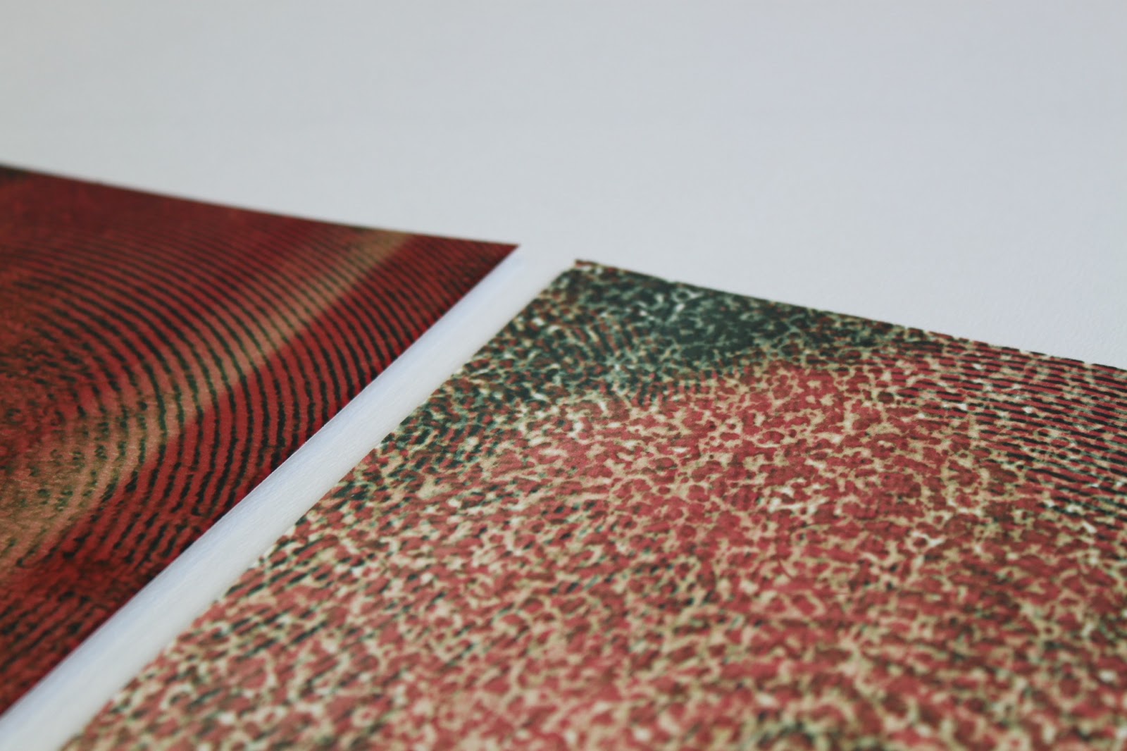
Printed experiments